Shape, selector, and layer-list are usually used to create custom drawable resources in android development. Those three XML elements can save a lot of UI resources and time if being used properly. This article will show you how to use them correctly.
1. Custom Drawable File Overview.
- All the three XML elements should be defined in an XML file under the app/res/drawable folder. The file name is just the drawable resource id.
- For example, if app/res/drawable/my_layer_list.xml is just the file. Then you can refer to it in both java code or other XML files.
- Refer to the my_layer_list.xml in Java Code: R.drawable.my_layer_list.
- Refer to the my_layer_list.xml in Xml Code : Android:background=”@drawable/my_layer_list”.
2. Shape.
The shape is used to define custom shapes in android drawable resources. It is used in both selector and layer-list elements. It has the below properties.
- Android:shape : Value can be “line“, “rectangle“, “oval” or “ring“.
2.1 Shape’s Sub Element.
2.1.1 <gradient>.
- The gradient XML element is used to define color gradual change style. It has the below attributes.
- Android:startColor: Start color value.
- Android:endColor: End color value.
- Android:angle: Gradient angle, 0 means from left to right, 90 means from bottom to top, the value should be an integer that is multiple of 45, the default value is 0.
- Android:type: linear, radial, and sweep.
- Below is an example of the gradient XML element.
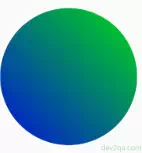
- Below is the above example’s XML source code.
<shape android:shape="oval">
    <gradient android:startColor="@color/colorBlue"
                android:endColor="@color/colorGreen"
                android:angle="45"
                android:type="linear"/>
</shape>
2.1.2 <solid >
- The solid XML element is used to define shape internal fill color. It will override the <gradient> attributes effect. It has the below attributes.
- Android:color: The color value that is used to fill the shape.
- Below is an example of the solid XML element.
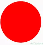
- Below is the above example’s XML source code.
<shape android:shape="oval">
    <solid android:color="@color/colorRed" />
</shape>
2.1.3 <stroke >
- The stroke XML element is used to define shape bolder style. It has the below XML attributes.
- Android:width : Border width.
- Android:color: Border color.
- Android:dashWidth : Dash border width.
- Android:dashGap: Gap between two dashes of the border.
- Below is an example of the stroke XML element.
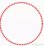
- Below is the above example’s XML source code.
<shape android:shape="oval">
    <stroke android:color="@color/colorRed"
             android:width="5dp"
             android:dashGap="3dp"
             android:dashWidth="5dp"/>
</shape>
2.1.4 <corners >
- The corners XML element is used to define shape corner style. It has the below XML attributes.
- Android:radius: The radius of the corner. The bigger the radius value, the round-shaped the corner.
- Android:topRightRadius: Top right corner radius value.
- Android:bottomLeftRadius: Bottom left radius value.
- Android:topLeftRadius: Top left radius value.
- Android:bottomRightRadius: Bottom right radius value.
- Below is an example of the corners XML element.
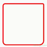
- Below is the above example’s XML source code.
<shape android:shape="rectangle">
    <corners android:topLeftRadius="10dp"
              android:topRightRadius="5dp"
              android:bottomLeftRadius="15dp"
              android:bottomRightRadius="20dp" />
</shape>
2.1.5 <padding >
- The padding XML element is used to define the padding values. It has the below XML attributes.
- android:top: Top padding value.
- android:bottom: Bottom padding value.
- android:left: Left padding value.
- android:right: Right padding value.
- Below is an example of the corners XML element. There are two custom shapes in the below example. The green shape is drawn at the top because it is defined at last in the layer-list definition.
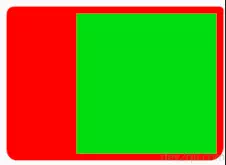
- Below is the above example’s XML source code.
<layer-list xmlns:android="http://schemas.android.com/apk/res/android">
    <item>
        <shape android:shape="rectangle">
            <corners android:topLeftRadius="10dp"
                      android:topRightRadius="5dp"
                      android:bottomLeftRadius="15dp"
                      android:bottomRightRadius="20dp" />

            <solid android:color="@color/colorRed" />

            <padding
                android:left="100dp"
                android:top="10dp"
                android:right="10dp"
                android:bottom="10dp" />

            <size
                android:width="200dp"
                android:height="200dp" />
        </shape>
    </item>

    <item>
        <shape android:shape="rectangle" >
            <solid android:color="@color/colorGreen" />
            <size android:width="200dp" android:height="200dp" />
        </shape>
    </item>

</layer-list>
2.1.6 <size>
- The size XML element is used to define the shape width and height value.
3. Selector.
The selector is used to define the view component’s background color or background image by it’s various states.
3.1 View Component’s State.
A view component has various state. For example, a button has following states:
- android:state_pressed : Boolean value, true means button is pressed, false means button is not pressed.
- android:state_enabled : Boolean value, true means button is enabled, false means button is disabled.
- android:state_focused : Boolean value, true means button is focused, false means button lost focus.
- android:state_window_focused : Boolean value, this is the button default state. It is same as do not specify button state.
3.2 Selector Definition.
You should define a selector in a xml file under app / res / drawable folder. Such as my_selector.xml
You can define several items in the selector definition xml file. Each item include a drawable object (color or image) that will be used for a button state.
Android system will check each item in the selector by it’s list order, if one item match current button state, then use that drawable object. If no state match, then use default item.
Please Note : The default state item should be written in the end of the selector xml. If you put it at the beginning of selector xml, no other state will take effect.
<selector xmlns:android="http://schemas.android.com/apk/res/android">

    <item android:state_pressed="true"
           android:drawable="@color/colorGreen" />

    <item android:state_pressed="false"
           android:drawable="@color/colorYellow" />

     <!-- This is the default state item, it is same as <item android:drawable="@color/colorRed" />
          This item should be written in the end. -->
     <item android:state_window_focused="true" android:drawable="@color/colorRed"/>

</selector>
From above example, we can see below default state item at the end of the xml.
<item android:state_window_focused="true" android:drawable="@color/colorRed"/>
It behaves same as below default state item.
<item android:drawable="@color/colorRed"/>
If we apply above selector drawable to a button as background.
<Button
    android:id="@+id/selectorButton"
    android:layout_width="wrap_content"
    android:layout_height="wrap_content"
    android:background="@drawable/my_selector"
    android:text="Click Me"
    android:layout_gravity="center_horizontal" />
We can see below screen effect. When the button is pressed, the background color is green, when not pressed the background color change to orange.
If you can not watch the above video, you can see it on the youtube URL https://youtu.be/t-D2511VoYg
Above example use some custom color variables, if you do not know, please read How To Define Custom Color Variables In Android Studio.
Learned alot. Thanks…